Tour a German publisher: Kiepenheuer and Witsch in Cologne
An office with a view--Cologne Cathedral is right there!
Last week, our local library visited a local publisher . . .
It’s a famous old German publisher: Kiepenheuer & Witsch. Their offices look right out onto the Cologne Cathedral. Their location next to the main Cologne rail station make it easy for their internationally renowned authors to drop by for coffee.
They have a fascinating history. After World War II, German publishers were shut down while the world decided which communication channels could be trusted.
Kiepenheuer & Witsch was one of the first to receive permission to resume publishing (because the Nazis had shut them down earlier.)
Our tour was "in publishing order" from the front desk:
Welcome to Kiepenheuer & Witsch!
To the magical mail room:
Isn’t this an amazing heirloom scale?
There’s something very Hogwarts about it. Even though Pottermail goes via owl.
You can’t have more than 30 kilos of books on this scale at a time.
Behind me, there are shelves of the *top secret* advanced reader copies of all the new books.
T-shirts for the publisher's soccer team hang on the mailroom wall.
KiWi is a hip abbreviation for Kiepenheuer & Witsch and the name of a paperback imprint begun in 1982.
These photos are their author portraits. Don’t you like the sideways bookcases in the hall?
Once you have your second book published with Kiepenheuer & Witsch, you can have your portrait on their walls.
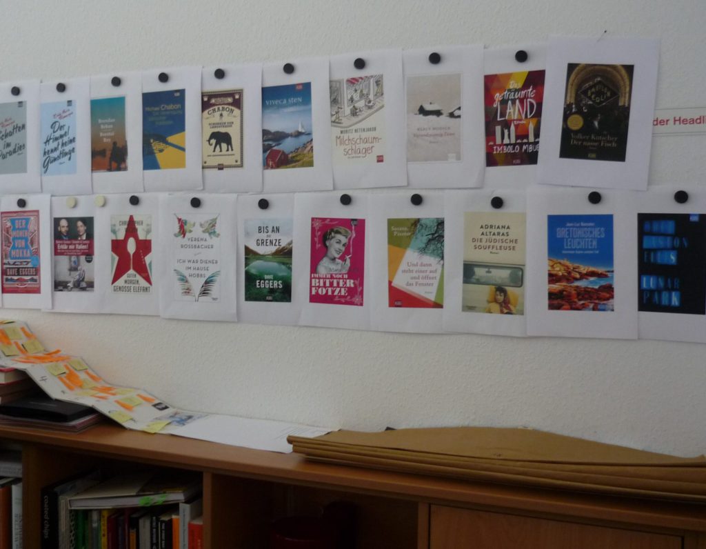
Book Cover Design Is Next
We were allowed to take pictures of these final versions, but the concepts for the next catalog are top secret. They publish 100 new books a year with about a dozen editors. People work hard here!
In contrast to books published by other German publishers, Kiepenheuer & Witsch books don’t have a uniform look.
Each book’s design is based on “what the author put in it”.
That’s the way to an author’s heart. 🙂
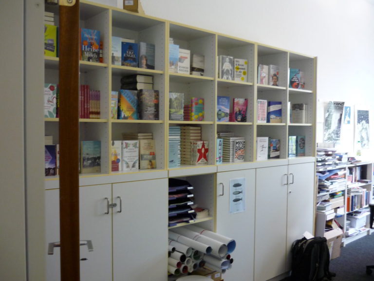
Finished books in the marketing department are ready to entice bookstore owners:
Posters and finished books, like a giant box of brand-new chocolates. The Kiepenheuer & Witsch sales department is ready to go out to bookstores.
World Championship-Level Book Formatting
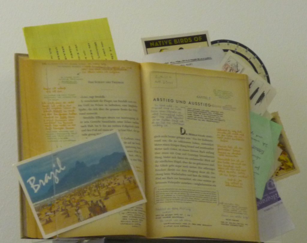
This book, titled simply S, by Doug Dorst and J.J. Adams, is the designer’s ultimate formatting dream.
*cough* Nightmare?
There are guides about how to read this book with notes and accessories but there was no guide for putting it together.
This book might seem like the ultimate argument for a print book, but there are ebook versions. (My head hurts thinking about it!)
The German translation is 10 to 35% longer than the English original. That means all of those hand-lettered margin notes had to be re-done.
What a challenge to the idea of a book!
This isn't an old book--it was published with all these extras!
Your mission should you accept it: Make the German translation, probably longer, fit into exactly the same space on every page. Include two colors of hand-written notes in the margins and all kinds of crazily formatted postcards, shopping lists, and paper reference dials.
The subtitle sums it up: First Aid for German Problems. This book calls to me. For years, my relatives and friends have been using German in ways I never learned in class. This book promises to make everything clear–in a light-hearted way.
My city library lists an edition with over 700 pages. Yikes! That’s a lotta German grammar. But I’d really love to understand why my German relatives say things the way they do.
The title means: the dative case is the death of the genitive case. A grammar murder mystery? I know–it sounds deadly–oops!
[If you’re wondering: English sort of has these “cases” but we’re not as serious about them. Dativ is somewhat like what we call indirect objects: I gave it to him. Genitiv is somewhat like using apostrophes. The author’s book.]
Kiepenheuer & Witsch's decisions shaped the kind of publisher they have become.
The tour made me think about the role of a publisher in society.
How do you decide which books to publish?
What is a “book?”
What will make readers want your books?
How will you show authors you value them?
What public conversations will you start or take part in?
Who’s going to try and shut you down?
Hope you enjoyed the tour as much as I did!
This tour happened right around the time Bumpity Boulevard Press began:
You can read our story here or browse our catalog.